Guanglo Select is a premium cross-border commerce platform connecting China and the United States through curated products and customization. Rather than serving the mass market, the company focuses on consumers who value craftsmanship, quality, and thoughtful design.
My role was to work with the founders to define the brand strategy and build a scalable identity and commerce system from the ground up.
Challenge
Today's e-commerce platforms are optimized for scale, promotion, and endless choices. Guanglo Select wanted to take the opposite approach: creating a calmer, more intentional shopping experience for customers who value quality over quantity.
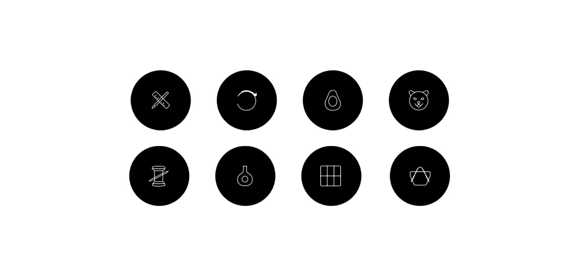
The challenge was to establish a visual language capable of supporting eight distinct business categories while maintaining a consistent premium brand perception.
Strategy
Through discussions with the founding team, we identified two core characteristics of the target audience:
They appreciate meticulous attention to detail.
They prefer an experience free from unnecessary advertising and visual distraction.
These insights became the foundation of the design strategy. Instead of competing for attention, the brand would communicate through restraint, clarity, and consistency.
Design System
The identity system is built around a refined "G" monogram and the GUANGLO wordmark, designed to remain balanced across digital products, packaging, and marketing materials.
To support both self-operated products and third-party merchants, I created a unified commerce system covering:
Brand identity / Product image standards / Product detail page templates / Typography / Iconography / Content guidelines
This framework enables different product categories to feel like parts of one coherent brand.
Visual Language
Every visual decision was made to reduce noise rather than create it.
A restrained grayscale palette, lightweight typography, generous whitespace, and subtle iconography allow products to become the visual focus while reinforcing the brand's premium positioning.
The result is an experience that feels calm, refined, and trustworthy.
Outcome
The project established a scalable brand foundation that supports multiple product categories while maintaining a consistent premium identity.
项目背景
光选好物(Guanglo Select)是一家连接中国与美国的中高端跨境电商平台,以精选商品与定制服务为核心业务。不同于面向大众市场的综合电商平台,品牌专注于服务那些重视产品品质、匠心工艺与设计价值的消费人群。
我的职责是与创始团队共同梳理品牌定位,从零开始构建一套可持续扩展的品牌识别系统与电商设计体系,为品牌未来的发展奠定统一的设计基础。
商业挑战
如今的大多数电商平台,都围绕着更多商品、更低价格、更高曝光和持续促销而设计,用户每天都需要面对大量的信息和视觉干扰。
光选好物希望选择另一条道路 —— 为追求品质而非数量的消费者,打造一个更加克制、安静且富有秩序的购物体验。
设计最大的挑战在于:如何在覆盖八个不同业务板块的同时,依然保持统一且具有辨识度的品牌形象,让用户始终感受到一致的高品质体验。
设计策略
通过与创始团队多轮讨论,我们提炼出目标用户最核心的两个特征:
愿意为产品细节与品质买单。
更倾向于不受广告、营销信息和视觉噪音干扰的购物体验。
这两个洞察成为整个品牌设计策略的起点。
相比通过夸张的视觉元素吸引注意力,我们希望品牌以克制、清晰和一致性的表达方式,建立用户对品质的信任感。
设计系统
品牌识别系统以简洁的大写 G 标识与 GUANGLO 标准字为核心,通过对比例、字重与留白的精细调整,使品牌能够在数字产品、包装、营销物料等不同场景中保持一致且稳定的视觉表现。
为了适配平台自营商品及第三方商家,我建立了一套统一的电商设计规范,包括:
品牌视觉识别 / 商品主图规范 / 商品详情页模板 / 字体系统 / 图标系统 / 内容展示规范
这套设计系统让八个不同业务板块拥有统一的品牌语言,同时保留各自产品的特色,使整个平台呈现出完整而连贯的品牌体验。
视觉语言(品牌体验)
整个视觉体系的目标,并不是创造更多视觉刺激,而是减少不必要的信息干扰。
设计采用克制的灰阶色彩、更轻盈的字体比例、充足的留白以及简洁的图标系统,让商品本身成为视觉主角,同时进一步强化品牌高品质、可信赖的定位。
最终呈现出的品牌体验,是安静、克制、精致且值得信赖的。
项目价值
为光选好物建立了一套可持续扩展的品牌基础,使多个业务板块能够在统一的视觉体系下协同发展,并持续保持品牌的一致性与辨识度。